Hey, those of you in RSS readers, hop over to my actual site and check out the new layout. I even drew a new header. I rather like it.
On the sad side, I decided to try and make everything cleaner and simpler. Thus I tried to narrow down the amount of labels I have in the sidebar. Turns out batch editing labels is perilous. I'm still trying to find all my photography posts... Yep.
Anyway, what do you think?

Showing posts with label design. Show all posts
Showing posts with label design. Show all posts
Wednesday, February 01, 2012
Tuesday, February 08, 2011
Little S is turning 1!
Invitation I did up for little S's party (yes her full name is on the ones I sent out :P)

Rainbow party, here we come!

Rainbow party, here we come!

Sunday, January 30, 2011
New website!
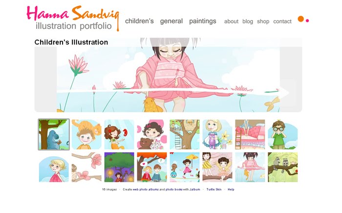
No scrapbooking was done this week, I was too busy giving my portfolio site an overhaul. I cheated and used jalbum for most of it, which should make it much easier to update than my hand coded site was. Easy is good, as I am lazy about updating! Check it out here: hanna-sandvig.com. Let me know what you think, and if it seems to be working well for your computer set-up :)
And that's another one off the list.
Friday, May 28, 2010
New Layout
Those of you using a feed reader should wander over and see my new layout. The pompoms in the nursery make me happy whenever I look at them so I hope they'll have a similar effect on you! I never really liked the last design but soon after I made it I got pregnant with little S...and the rest is history.
Tuesday, June 16, 2009

Friday, April 10, 2009
In My Mom's Little World

Hooray, my Mom's blog and website have merged into one thing of beauty after many hours of pretending I know CSS (thanks Karl!). I think I kinda do know CSS now...fake it till you make it I say.
That would be geek talk. Here is real talk, check out the pretty site I made my mom over here: ValerieComer.com.
Thursday, February 26, 2009
Bang!
Check out the blog I designed for Jen (my S-I-L) who's running for a student government position at UVIC. It's different from what I usually do and was a good time. So if you go to UVIC, vote for Jen!

BANG for UVSS!

BANG for UVSS!
Tuesday, December 30, 2008
Blog Tour: Lost Genre Guild - Day 2
Welcome to day two of the Blog Tour Featuring the Christian science fiction and fantasy site: Lost Genre Guild.
Today I'm going to ignore the site's content and give the webpage a design review. Because as a graphic designer I can't help myself. As many of you know :P

What I liked:
- All the text is easy to read. This should be a given, but tragically is not. So props for that.
- Overall design is simple with a cohesive colour scheme. They didn't try to be clever with background images or other things that make the eyes burn. I like the colours actually, and I've always been a stripes fan.
- Half points for navigation, all the links are easy to understand and are reasonably well organized.
- Good use of content, there aren't any useless pages, and usually a good amount of information per page.
- Hooray for having a contact form! Mailto: links make me (and everyone else using a web-based browser) cranky.
What I'd change (I'm a little nit picky, but it's in love. Promise):
- The banner. It's small enough that it should have been saved at 100% quality, it would look a lot better. Also, Papyrus. Oh Papyrus. Everyone uses that font. It's the new comic sans. I know, I know, it's pretty and easy to read. Trust me though, it's making the site look less professional. I could devote a whole blog post to papyrus. But not today. Go to Dafont.com and find something pretty.
- Something that was probably overlooked, the Guild Review and Bookshelves pages have no navigation bar. They need it.
Wait, I just noticed that the bookshelf have interior navigation above the banner. I've been to the site 5 times and I just noticed now. I'd still give the pages navigation consistent with the rest of the site and put the bookshelf navigation somewhere else. As a drop-down from the main navigation preferable.
- Also, with the banner again, I would just keep the same banner throughout and put the page headers on the pages. If that makes sense. People are a lot more likely to notice them there.
- I was going to post about the navigation links on the main page to the blog and the forum. Those should be with the rest of the navigation. But now they are gooone. Are you guys changing things right now?
- The bookshelf (which I love by the way) doesn't have covers for all the books. Some have bright red squares. I don't know why, but I don't like it.
- The footer is too big and messy. It should just contain a couple lines of text, anything else should be placed somewhere else on the site where you want people to see it.
- Actually the whole first page is a bit confusing. I'd include a brief blurb, a link to the most recent featured book, and maybe a news update.
- I'd also embed the blog somewhere on the site. This makes the search engines happy because you seem updated more often, you'll rank higher and more people will see the site.
Overall Impressions:
Overall the site is pretty good. It communications it's goals well and has a cohesive vision and look. It's not a professional looking design, but it's also not trying to hard. Simple is good. Three Stars out of Five.
Today I'm going to ignore the site's content and give the webpage a design review. Because as a graphic designer I can't help myself. As many of you know :P

What I liked:
- All the text is easy to read. This should be a given, but tragically is not. So props for that.
- Overall design is simple with a cohesive colour scheme. They didn't try to be clever with background images or other things that make the eyes burn. I like the colours actually, and I've always been a stripes fan.
- Half points for navigation, all the links are easy to understand and are reasonably well organized.
- Good use of content, there aren't any useless pages, and usually a good amount of information per page.
- Hooray for having a contact form! Mailto: links make me (and everyone else using a web-based browser) cranky.
What I'd change (I'm a little nit picky, but it's in love. Promise):
- The banner. It's small enough that it should have been saved at 100% quality, it would look a lot better. Also, Papyrus. Oh Papyrus. Everyone uses that font. It's the new comic sans. I know, I know, it's pretty and easy to read. Trust me though, it's making the site look less professional. I could devote a whole blog post to papyrus. But not today. Go to Dafont.com and find something pretty.
- Something that was probably overlooked, the Guild Review and Bookshelves pages have no navigation bar. They need it.
Wait, I just noticed that the bookshelf have interior navigation above the banner. I've been to the site 5 times and I just noticed now. I'd still give the pages navigation consistent with the rest of the site and put the bookshelf navigation somewhere else. As a drop-down from the main navigation preferable.
- Also, with the banner again, I would just keep the same banner throughout and put the page headers on the pages. If that makes sense. People are a lot more likely to notice them there.
- I was going to post about the navigation links on the main page to the blog and the forum. Those should be with the rest of the navigation. But now they are gooone. Are you guys changing things right now?
- The bookshelf (which I love by the way) doesn't have covers for all the books. Some have bright red squares. I don't know why, but I don't like it.
- The footer is too big and messy. It should just contain a couple lines of text, anything else should be placed somewhere else on the site where you want people to see it.
- Actually the whole first page is a bit confusing. I'd include a brief blurb, a link to the most recent featured book, and maybe a news update.
- I'd also embed the blog somewhere on the site. This makes the search engines happy because you seem updated more often, you'll rank higher and more people will see the site.
Overall Impressions:
Overall the site is pretty good. It communications it's goals well and has a cohesive vision and look. It's not a professional looking design, but it's also not trying to hard. Simple is good. Three Stars out of Five.
Sunday, August 24, 2008
Logos for Amethyst
So my friend Amethyst is a wonderful photographer and she asked me to design her a logo to use for watermarking her work. This is what I came up with:

It's my favourite logo I've done so I'm pretty happy :)

It's my favourite logo I've done so I'm pretty happy :)
Thursday, August 21, 2008
Mountain View Stoneworks
New website finished! This is for my Aunt and her husband, he does stone engraving and she sells ice cream...comes together surprisingly well. I'm very happy with how this site turned out, probably because I'm obsessed with lime green at the moment...
View site [here]

View site [here]

Wednesday, August 20, 2008
Mermaids and Musicals
Went to see Momma Mia tonight with my aunt and my gramma. Good times. I have an undying love for ABBA. Don't tell. My all time favourite musical is still Bride and Predjudice however, it has three things working in it's favour 1)Pride and Predjudice 2)Bollywood 3)catchy tunes. I love it forever. How about you guys? Favourite musicals? Pretend like you like commenting, it's pretty fun.
Been working on finishing up projects as the summer is coming to an end, got a couple submissions finished and ready to go today, finished another little website.
It's been raining like mad. All this water makes me think of mermaids. Okay no it doesn't but I have some pretty mermaids to show you and I didn't know how to tie it in smoothly...
Dearest Prince by 0Effe0

Beautiful mermaid photomanips by Vorfas on flicker (click the link for the set)

More fabric love...the Mendocino line by Heather Ross.

Crabby Chat by Imaginism Studios

Been working on finishing up projects as the summer is coming to an end, got a couple submissions finished and ready to go today, finished another little website.
It's been raining like mad. All this water makes me think of mermaids. Okay no it doesn't but I have some pretty mermaids to show you and I didn't know how to tie it in smoothly...
Dearest Prince by 0Effe0

Beautiful mermaid photomanips by Vorfas on flicker (click the link for the set)

More fabric love...the Mendocino line by Heather Ross.

Crabby Chat by Imaginism Studios

Friday, August 08, 2008
Not Dead
Just busy,
Monday I drew this guy (the bird on his head is a wilson's warbler.

Tuesday I helped my aunt for the opening day of her shop, and got my moo stickers in the mail!

Wednesday I worked on three storage bag things (still working...that one's the closest to done but isn't yet)

Thursday I built 1 1/2 websites:

Also I read all of Breaking Dawn, I was gonna wait for the paperback but it was so cheap in hardcover and I just couldn't resist. If you're a fan of the series you'll be very happy with how she ended it, that was one crazy book. Crazy.
and today I started prototyping for Mei's friend Elliot. Apparently he's taller...

And later today? Olympics time!

Monday I drew this guy (the bird on his head is a wilson's warbler.

Tuesday I helped my aunt for the opening day of her shop, and got my moo stickers in the mail!

Wednesday I worked on three storage bag things (still working...that one's the closest to done but isn't yet)

Thursday I built 1 1/2 websites:

Also I read all of Breaking Dawn, I was gonna wait for the paperback but it was so cheap in hardcover and I just couldn't resist. If you're a fan of the series you'll be very happy with how she ended it, that was one crazy book. Crazy.
and today I started prototyping for Mei's friend Elliot. Apparently he's taller...

And later today? Olympics time!

Sunday, August 03, 2008
Want a pretty blog layout?
Hanna is poor and is running low on books again. So here's the deal, if you'd like a new blog layout (either for blogger or wordpress) drop me a comment or email me (hannasandvig @ gmail.com...remove spaces). The charge is $50 in Amazon or Chapters online gift cards. That includes a simple layout and installation. A simple layout includes a banner which either a photo, a simple illustration or a design, the background and of course text colours. If you want something complicated, we can talk prices.
Here's a couple examples:
Is Bliss Like This?
The Lister Family
My Previous Layout 1
My Previous Layout 2
Here's a couple examples:
Is Bliss Like This?
The Lister Family
My Previous Layout 1
My Previous Layout 2
Wednesday, July 30, 2008
Design| Stitchin' Time
So my aunt is opening a fabric and yarn store next week and I've been doing her design work. Here's the sign and her business cards. Website will be up when her store opens and I've done some other bits and pieces. She likes the design and so do I!


Monday, July 28, 2008
Final Stitches
I just got back from a couple days of camping, good fun which I will share with you later once I get my pictures sorted. In the meantime here's a website I designed the graphics for and Karl coded. Final Stitches is a long arm quilting service, so if you have the urge to make a nice big quilt, do up the top and they can quilt it for you!


Sunday, July 06, 2008
huzzah!
New layout! I like this one better than the last one. So it should last at least a couple months.
Also we just watched Hero and it made me cry. Again. Speaking of which, you should all go see Kung Fu Panda. Very amusing, and really beautiful backgrounds. Worth buying the DVD in our books.
Also we just watched Hero and it made me cry. Again. Speaking of which, you should all go see Kung Fu Panda. Very amusing, and really beautiful backgrounds. Worth buying the DVD in our books.
huzzah!
New layout! I like this one better than the last one. So it should last at least a couple months.
Also we just watched Hero and it made me cry. Again. Speaking of which, you should all go see Kung Fu Panda. Very amusing, and really beautiful backgrounds. Worth buying the DVD in our books.
Also we just watched Hero and it made me cry. Again. Speaking of which, you should all go see Kung Fu Panda. Very amusing, and really beautiful backgrounds. Worth buying the DVD in our books.
Saturday, June 21, 2008
Re-Brand
New logo for my webpages and to watermark photos:

And spent some time making my signature look nicer than it really was for my art:


And spent some time making my signature look nicer than it really was for my art:

Tuesday, May 27, 2008
New Blog: Divine Inspiration

My delightful sister-in-law Jen and I have started a new art/craft/design blog called Divine Inspiration. It's going to feature some of the things you like about this blog (my friday five, art posts ect) as well as some fun new things (tutorials, Jen ect). So go over and give it a bookmark, it should be a lot of fun and we're aiming to update it every weekday :)
Click Heeeeere
Wednesday, April 23, 2008
On my desk...
Okay so this is not my desk...because it's surrounded by boxes...thus I have been sewing on my couch while watching America's Next Top Model (by the way, this season's girls are not so nice...why can't they get along? Haha, but I like how the plus size girl bakes and makes yummy food that only she'll eat). So here's my sewing kit...it's almost like a desk...

Also, I recently did a layout for the Lister's. I love the colours, but then it's no surprise as I love everything with chocolate brown.

Oh oh, and my ipod? I thought it was dead but it suddenly started working again! Hoooooray!
Anyway, off to pack and such. Try to get my house in order before I pick Jen up at the airport this afternoon.
So how are all you lovely peoples? What projects are you working on?

Also, I recently did a layout for the Lister's. I love the colours, but then it's no surprise as I love everything with chocolate brown.

Oh oh, and my ipod? I thought it was dead but it suddenly started working again! Hoooooray!
Anyway, off to pack and such. Try to get my house in order before I pick Jen up at the airport this afternoon.
So how are all you lovely peoples? What projects are you working on?
Subscribe to:
Posts (Atom)